 Doctoranytime · 2023–2024 · Full case article
From ‘Find a doctor.’ to ‘We’ve got you covered.’
Leading the repositioning of Doctoranytime from a doctor directory to a broader health ecosystem: a new brand, a complete product experience, a design system with tokens built for the business, and six new products across seven markets.
- RoleGlobal Head of Design
- ScopeStrategy, brand, product, design system, launch
- MarketsSeven, in Europe and Latin America
- Year2023–2024

The product had outgrown its original proposition.
Before 2023, Doctoranytime was primarily a doctor directory. Patients searched for a specialist, compared profiles and booked an appointment.
The model had worked for years, but the business was changing. People didn’t only need help finding a doctor. They needed information, guidance, access to specialised care and continuity after the appointment.
- Search: find a doctor.
- Compare: compare profiles.
- Book: schedule an appointment.
- Then the journey ended.

Healthcare professionals already on the platform
Markets across Europe and Latin America
Of B2C traffic on mobile
How do you redesign a live marketplace while changing what the business is?
We needed to transform an established product, with thousands of healthcare professionals and an existing user base, while introducing a new portfolio of health products. Without losing trust, users or market momentum.
Reposition without breaking trust.
An established platform with 30,000+ healthcare professionals and multiple markets couldn’t simply start over.
Build a system, not just a website.
The new experience needed to support the existing marketplace and a new portfolio of digital health products.
Ship at speed.
Strategy, brand, product design, user testing and production had to happen within roughly seven months.
From a doctor directory to a health ecosystem.
We shifted the product from a place to find a doctor to a platform that helps people with their entire health journey, from information to specialised care.
Doctor directory
- Search for a doctor
- Compare profiles
- Book an appointment
- End of journey
Health ecosystem
- Understand my health need
- Find the right care
- Get guidance and information
- Access specialised services
- Continue my care journey
Six new products. One platform, one health journey.
Where the old Doctoranytime had one product (book a specialist), the new platform launched a full ecosystem of services for different moments in someone’s health life. Each with its own name and proposition, all discoverable from the same homepage, navigation and app.
B2C subscription
Greece’s flagship subscription plan: exclusive discounts, priority booking and the full platform unlocked. The first product to validate patients paying for outcomes, not access.
Teleconsultation
On-demand chat or video consultations with 100+ licensed specialists. Doctoranytime became a live care provider for the first time.
Corporate benefits
Healthcare benefits for enterprise clients. The original B2B model, rebuilt for the new positioning rather than discarded.
Mental health clinic
Ongoing access to therapists, psychologists and wellbeing coaches, normalising continuous mental health support.
Medical cannabis clinic
Greece’s first online medical cannabis clinic: 70+ specialist doctors, digital prescriptions, chat, video or in person.
Weight management clinic
Nutrition, exercise, psychology and medical monitoring in one interdisciplinary, outcome-focused programme.
Three principles shaped the new experience.
Health-first, not directory-first.
Every decision should reinforce the idea that Doctoranytime is an ongoing health partner, not just a place to find a doctor.
Human, not clinical.
The experience needed to feel modern, approachable and trustworthy, moving away from traditional medical directory patterns.
Consistent at scale.
One design language across six products, seven markets and multiple teams.
An identity that matched the ambition.
The previous brand was strongly associated with a single action: finding a doctor. Together with G Design Studio, we created a new identity that could represent a broader, more human health ecosystem.
Then came the harder part: translating it into a real product. A brand identity is easy to approve in a presentation. The real test is what happens when it meets search flows, doctor profiles, navigation and real information.
The first versions were not the final answer.
Every version went in front of real users before the next one. What testing showed shaped the one after it, until the concept was clear enough to launch: a new product, a new identity and a new positioning, together with six new products at once.
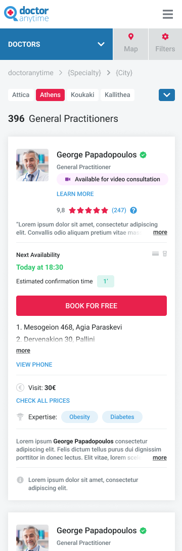
A doctor directory
Search, compare, book. Then the journey ended.

The brand meets the product
Tested with real users, it didn’t perform as well as we needed. More iteration and validation before the definitive rebrand.
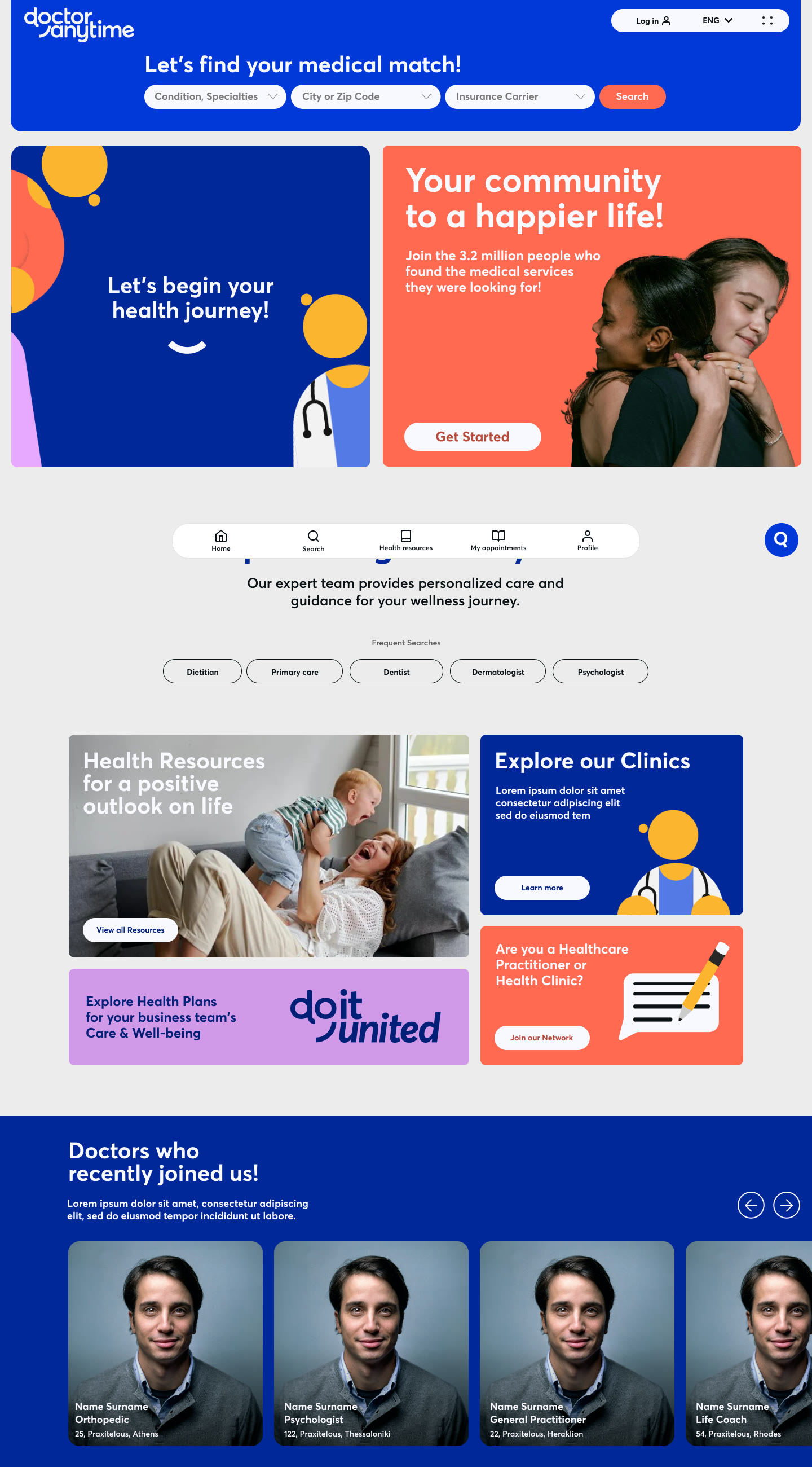
Rebuilt around real journeys
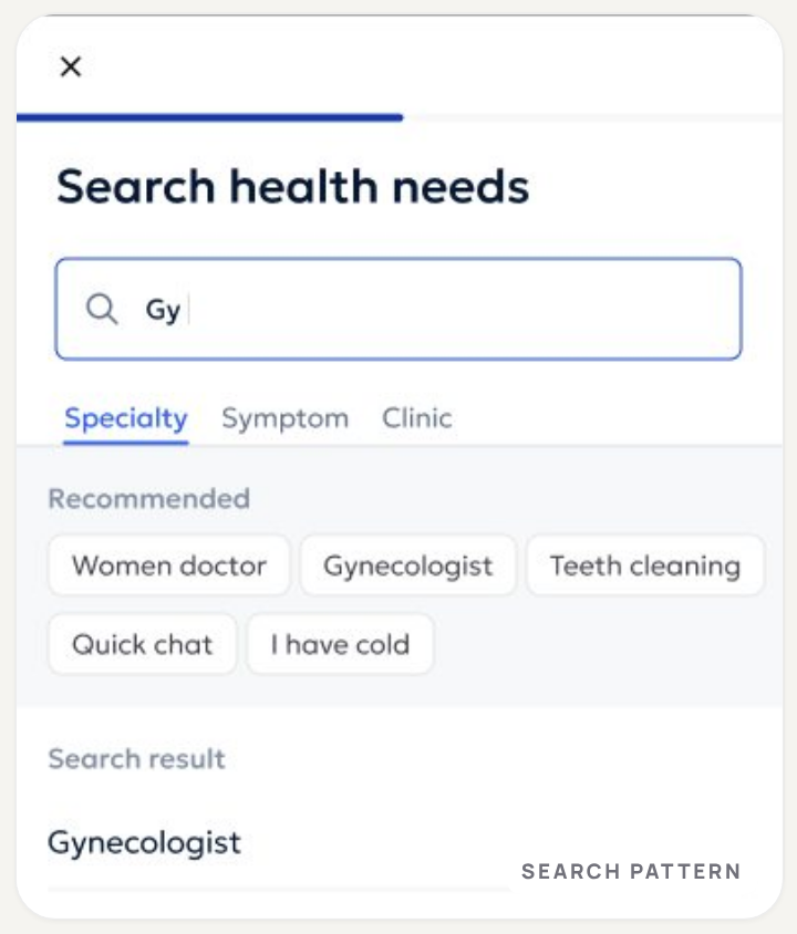
Patients stalled choosing a specialty, so the core flows were rebuilt from scratch and search started from a health need.

Less noise, sharper hierarchy
Testing asked for cleaner visuals, clearer information and a faster path to the key actions.

Search first, care right below
One search on the first fold, then the whole ecosystem, one scroll away.
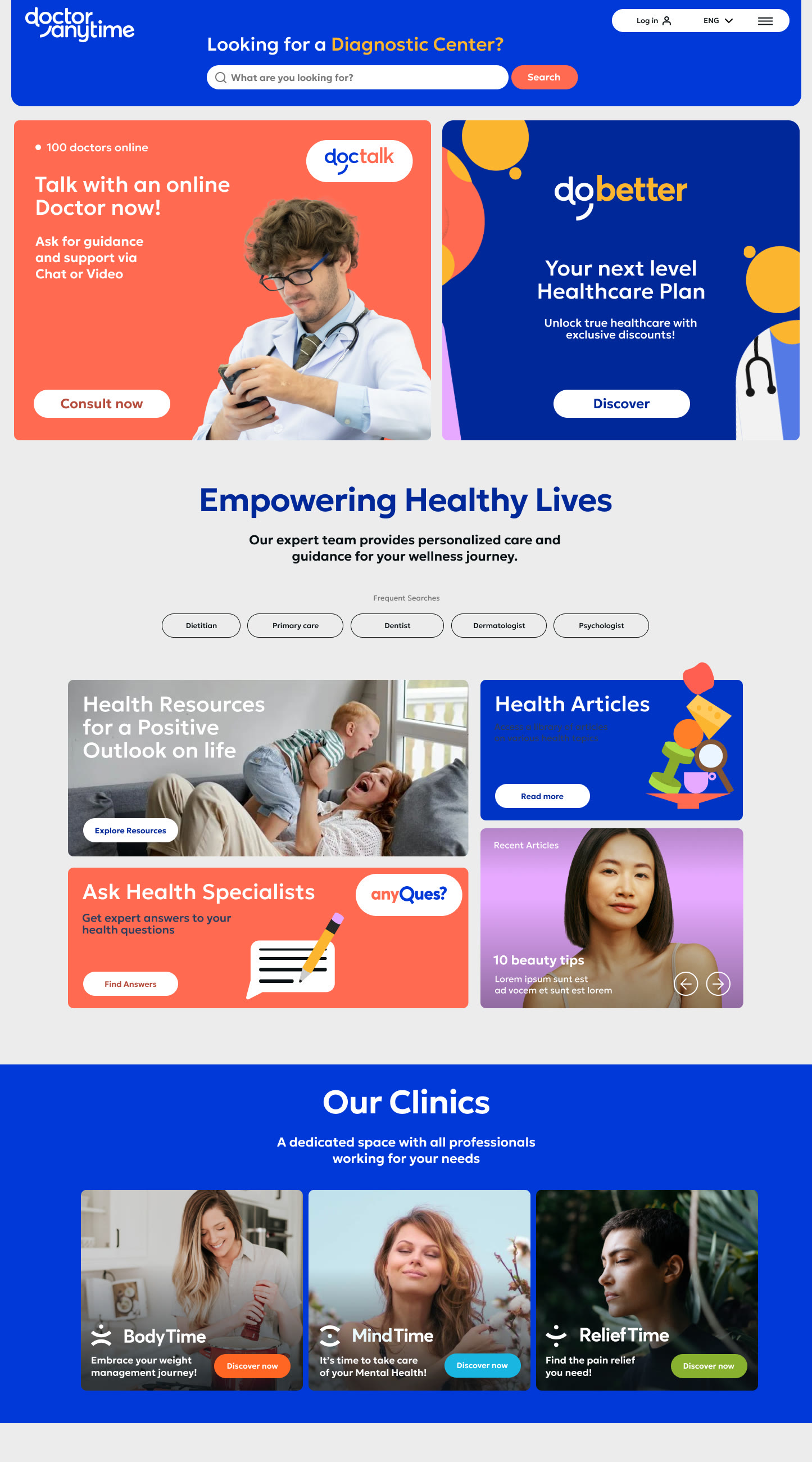
Launched in seven markets
Mobile and desktop, on one system.
Search that starts from a health need.
What user testing showed, and what it changed.
Less decoration
Some visual elements competed with content.
Sharper hierarchy
Key information needed to be clearer and faster to find.
Faster to what matters
Users wanted a more direct path to the main actions.
When 80%+ of users are on mobile, mobile is the product.
Every component, flow and interaction had to earn its place on a 390px screen first. Then the same system scaled up to desktop.
A home for the whole ecosystem.
Live care and six new products, from teleconsultation to three digital clinics, above the doctor directory. One search on the first fold, any health need.
Shipped · Live productHomepage
Search first, care right belowOur clinics
Three clinics, three identitiesFrom a health need to the right doctor.
Not isolated hero screens: one connected path. Search starts from a specialty, a symptom or a clinic; results put availability and price up front; the profile builds trust before booking.
Search
Find careResults
CompareDoctor profile
Build trustAsk anything, in your own words.
Search starts from a symptom, a worry or a question. An AI summary says why these specialists match, real availability sits on every card, and the visit type is chosen before booking: from a question to a booked visit, one calm step at a time.
Ask anything
Symptoms, worries or questions
Results that explain
An AI summary of why they match
Real availability
Next open slots on the card
Pick what you need
The visit type, then continue
The same system, on desktop.
The final desktop homepage: the mobile structure scaled up, with the ecosystem of products one scroll away.
Tokens with context, not just colours.
The design system followed the new brand concept. Beyond primitive tokens, decisions were named for the product and the business they serve, so six products could share one language and still feel like themselves.
That is how three clinics could carry three identities on the same components, and how one system adapted to seven markets.
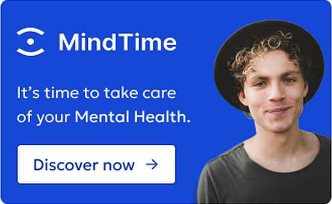
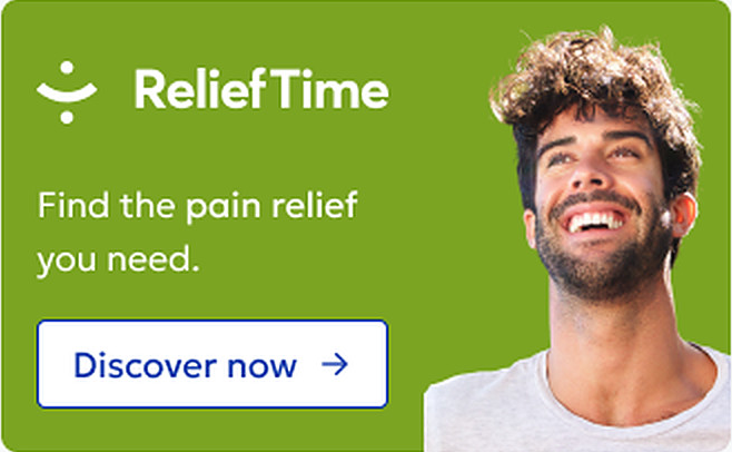
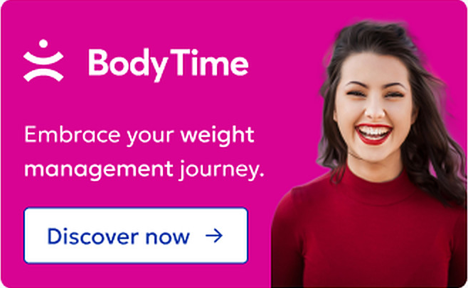
Same component, three contexts. Token names are simplified for illustration.
One library, every product.
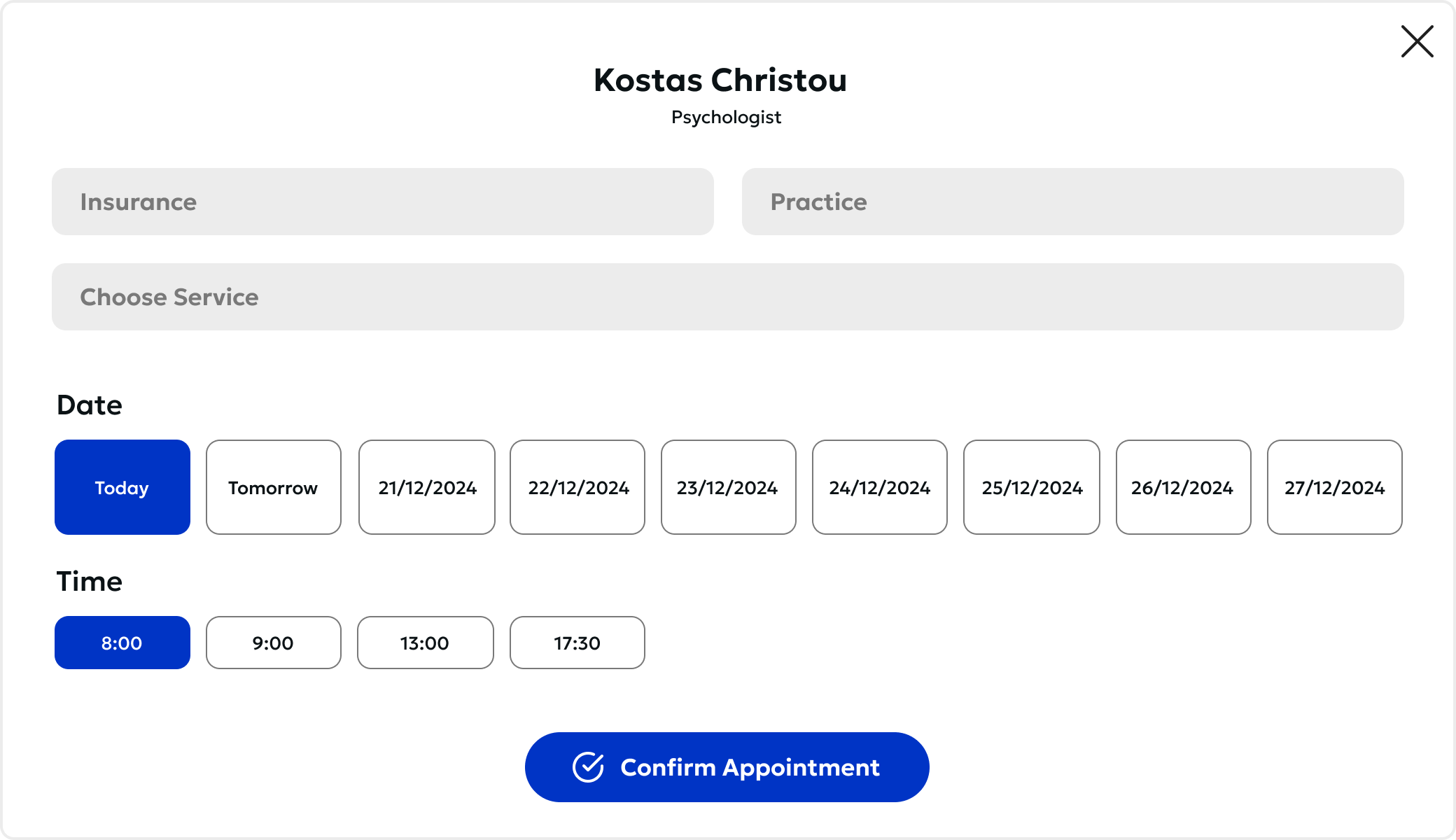
Doctor cards, search, booking and campaign blocks: built once, themed by context, reused across six products and seven markets. Along with design tokens, the system shipped templates for common flows, product guidelines and multi-brand support for every market.
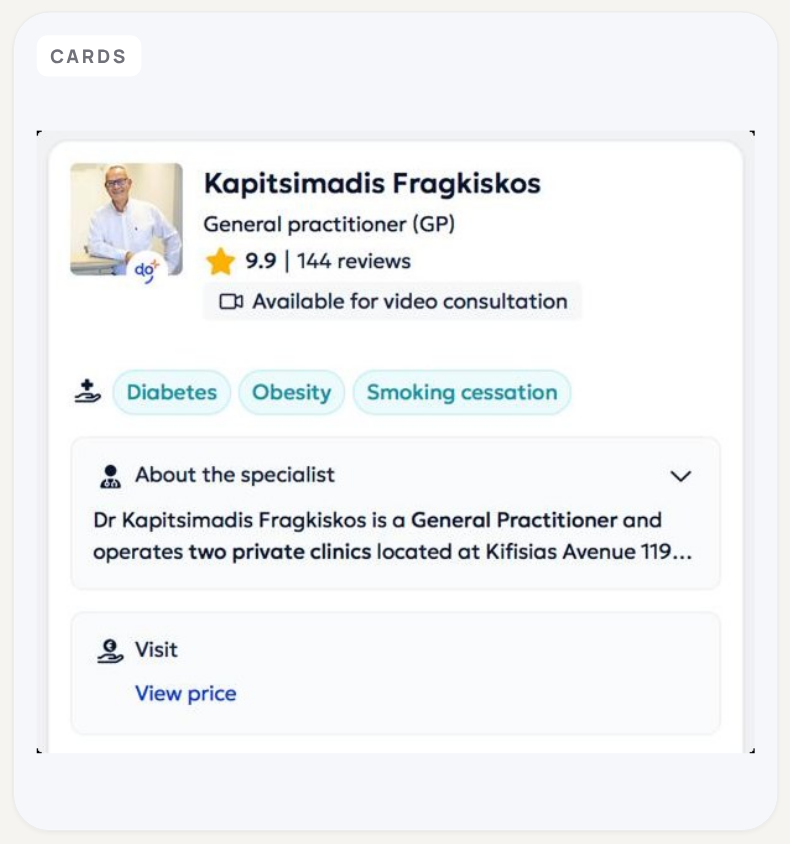
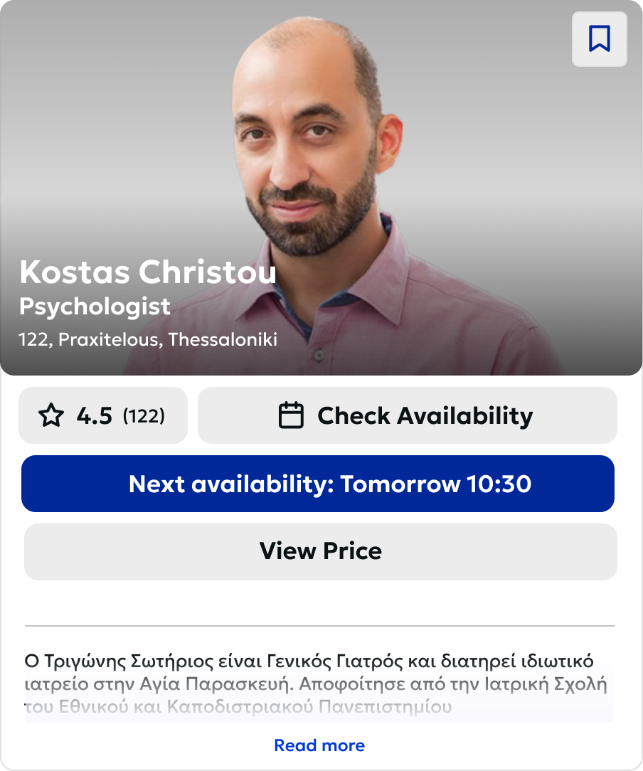
Seven months. Seven markets. A platform that finally matched its ambition.
Overall platform growth since launch. Strategy, brand, ecosystem design, testing and multi-market production, in under seven months.
B2B churn reduction.
Month-over-month growth from month five.
The new experience, design system and product portfolio were launched across all seven, adapted to local needs, languages and healthcare contexts.
New products launched.
B2C traffic on mobile.
Product success, measured with Google HEART.
HEART defined what success meant for the product experience; the figures above show the business impact.
Satisfaction with the new experience
Return visits and health content between appointments
Uptake of the new products
Patients returning between appointments
Finding and booking the right care
What I learned.
This project reinforced how important alignment, flexibility and long-term thinking are when working on complex, multi-market products.
Alignment is a design problem.
Distributed teams need shared language, shared references and shared ways of making decisions.
Systems enable ownership.
The design system became infrastructure for distributed teams, not just a component library.
Brand is never finished.
A new identity lives or dies in the decisions that happen after launch: how you test it, adapt it and keep learning.

Thanks for reading. Next up: FairSupply.
Bringing clarity to supply chain compliance: years of mathematical and legal research, turned into an ESG platform people use every week.